Industry
Cleaning Services
Location
United Arab Emirates
Year
2021
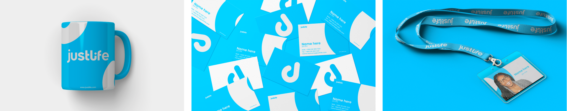
Deliverables
Brand Identity
Production
Campaign
Packaging
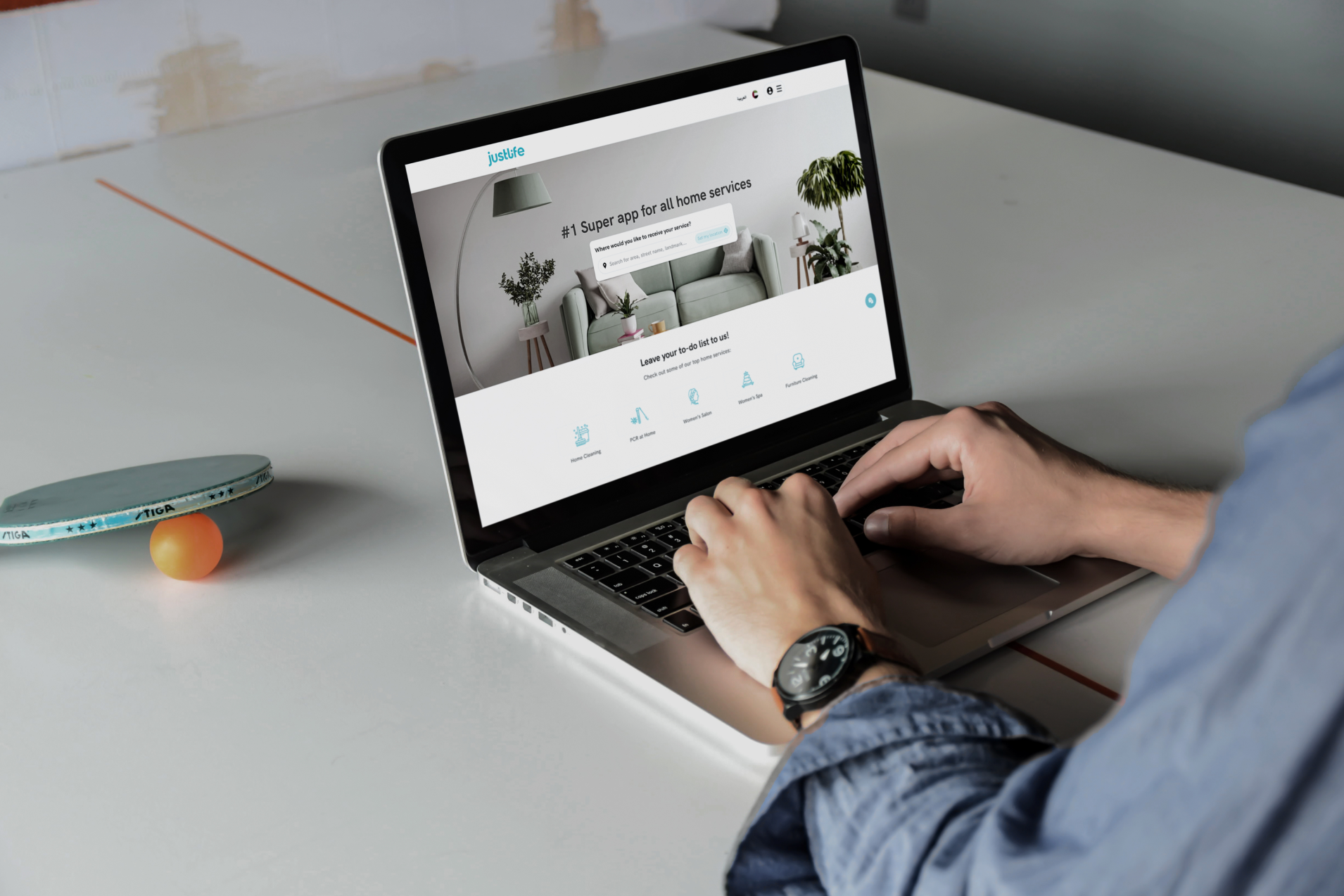
Justlife
Justmop came to DUCKLIFE with the challenge of bringing new life to their brand. Not because they were struggling - but because the name and brand identity just didn’t capture who they were anymore. After years of successful growth and an expansion across markets and services, the singularity of Justmop didn’t make sense and a change was needed.
So we asked ourselves a simple question - why do people use these services? And we realised it’s because people want to just spend their time on the things that matter to them - ultimately they want to just live life and so Justlife was born.
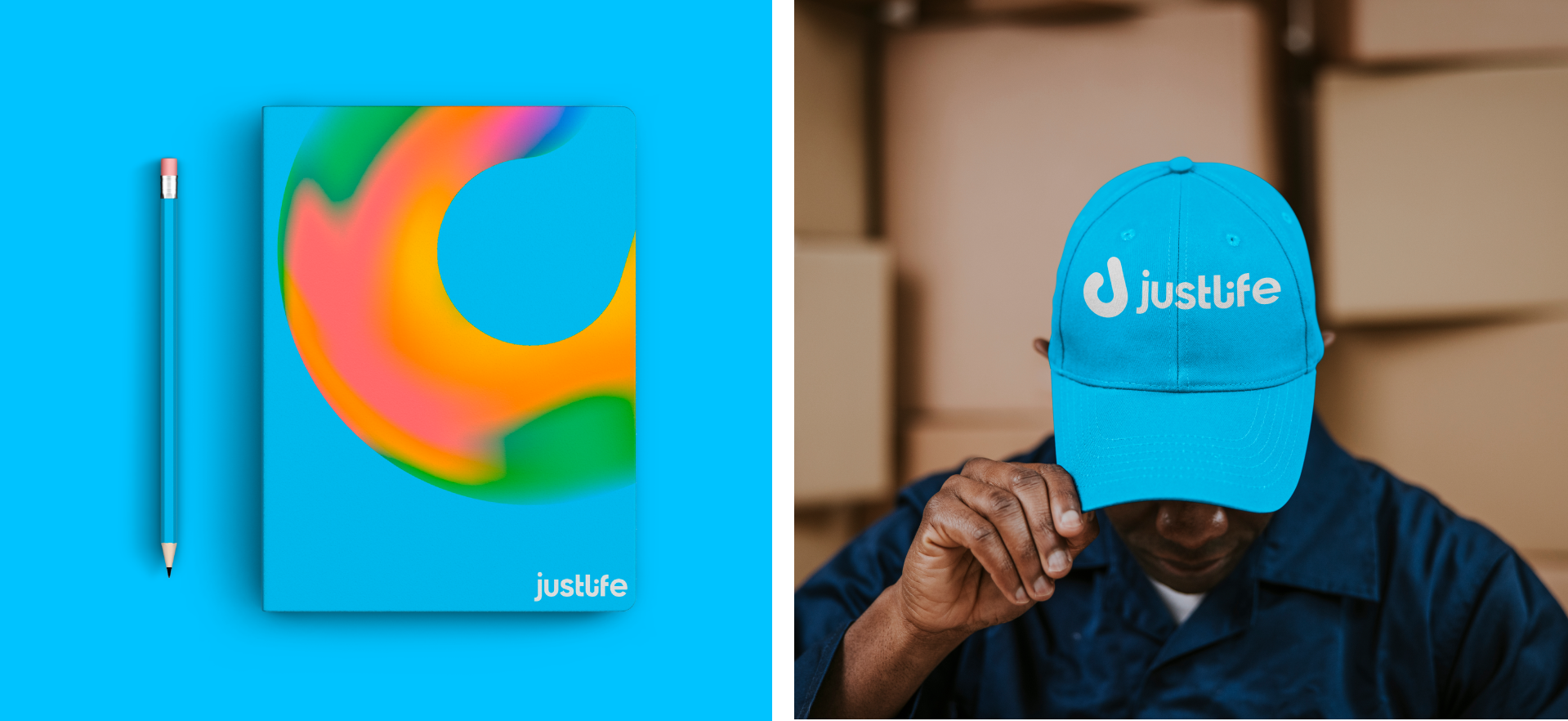
Brand Colours
Brand Element
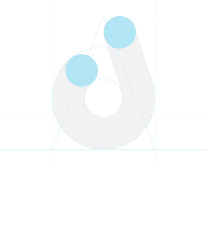
Justlife icon is made up of three elements that are responsible for the broader brand story. The earth representing the circle of life, the location pin representing convenience, and the J representing an already existing brand element.
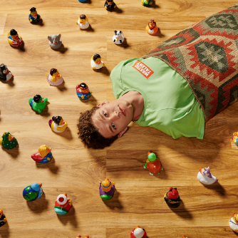
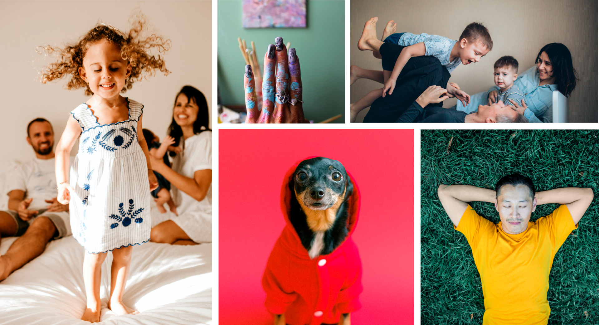
Photography
Joy
Human
Fun
Young
Reliable
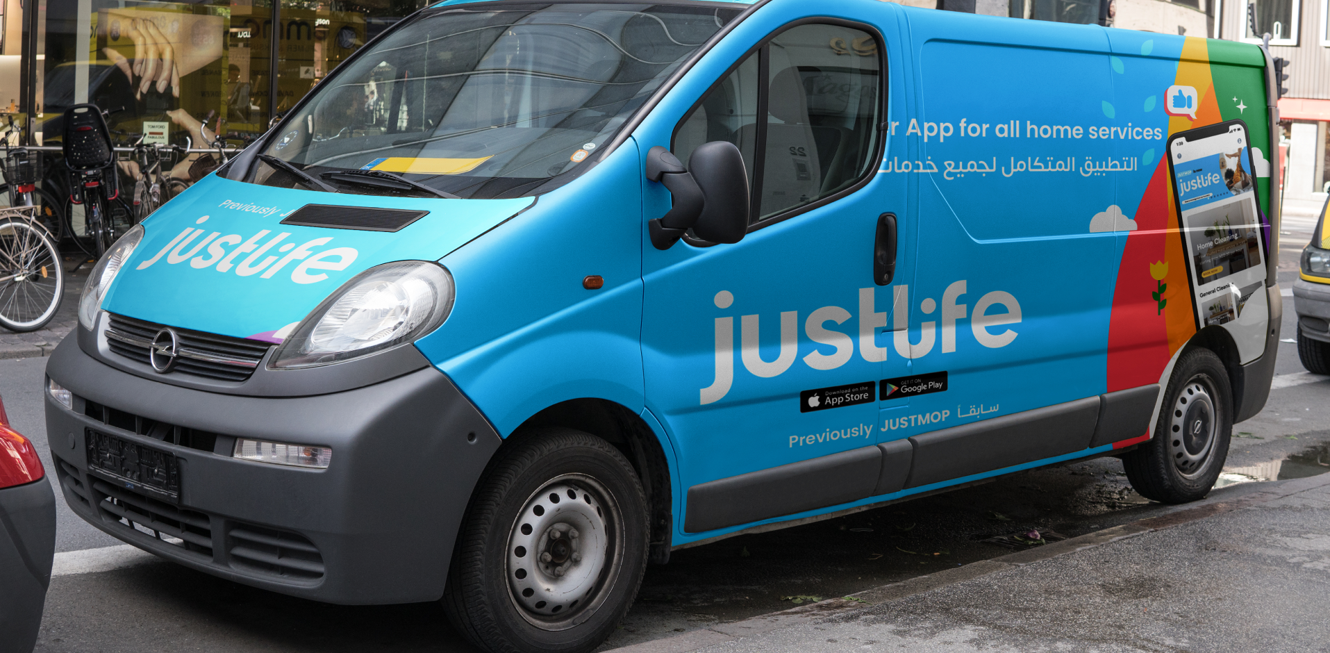
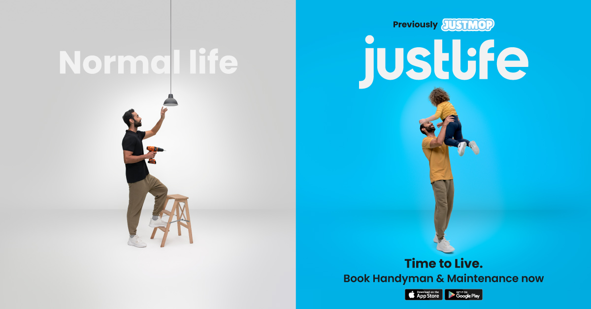
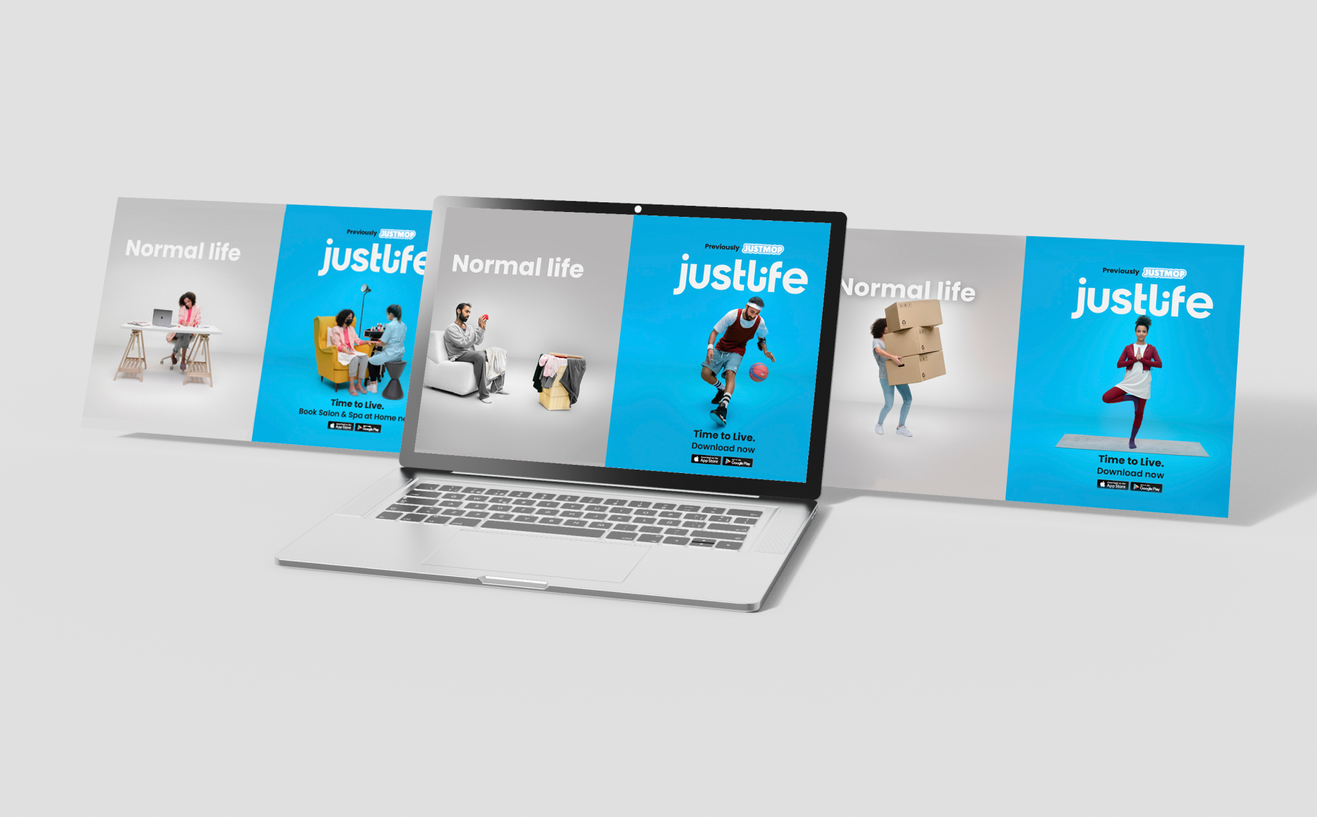
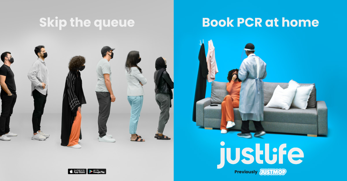
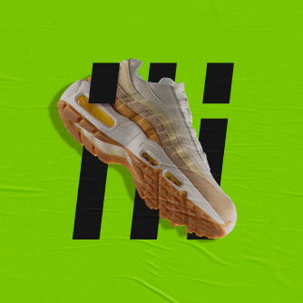
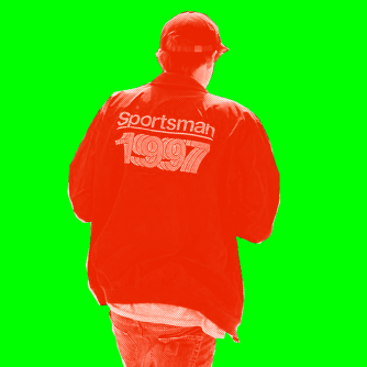
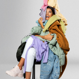
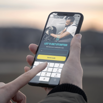
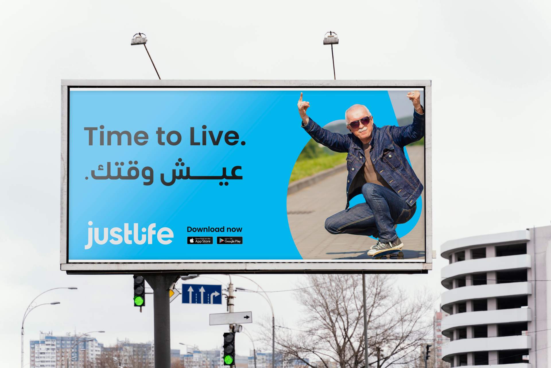
Campaign
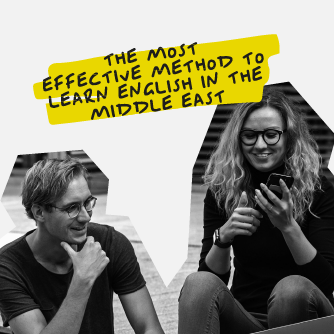
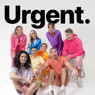
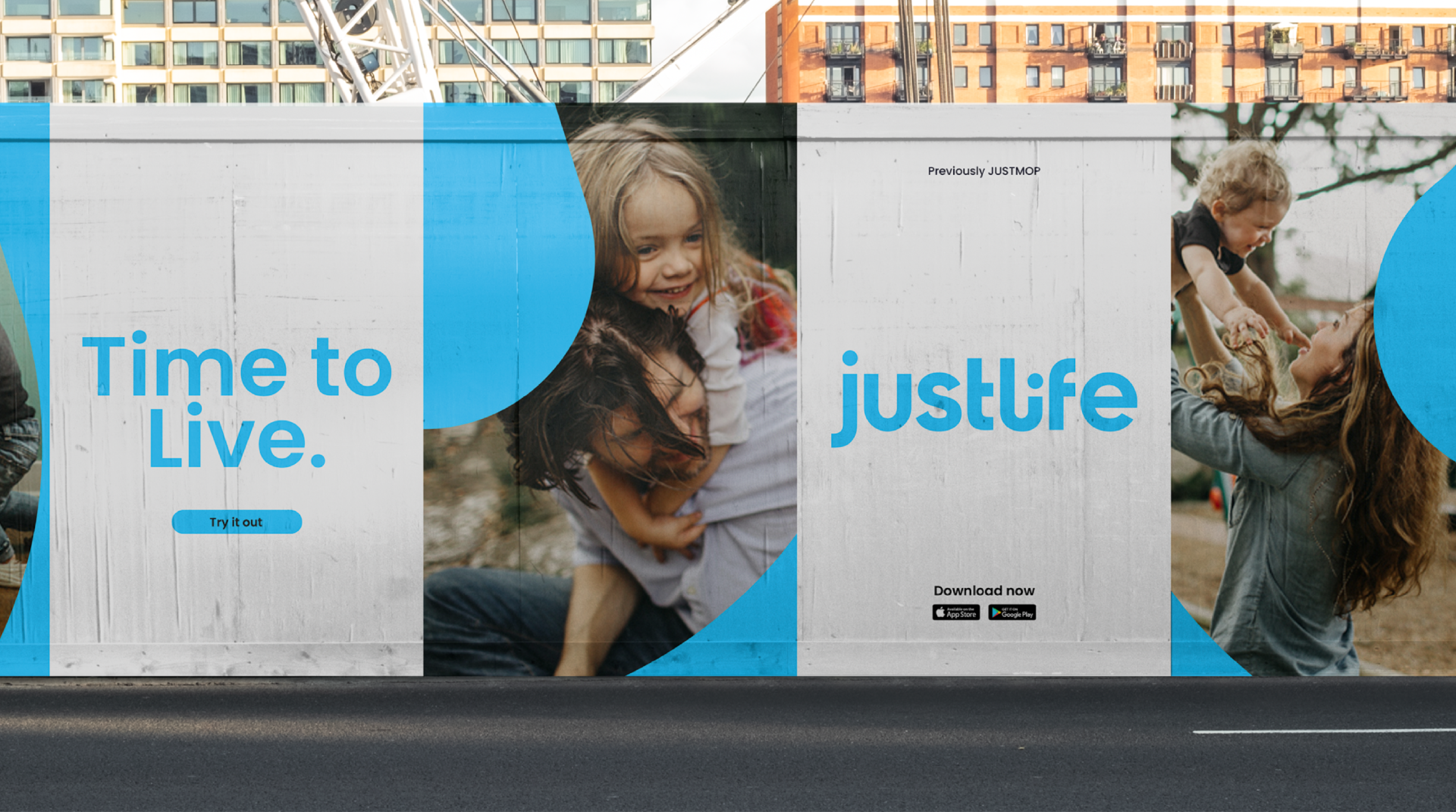
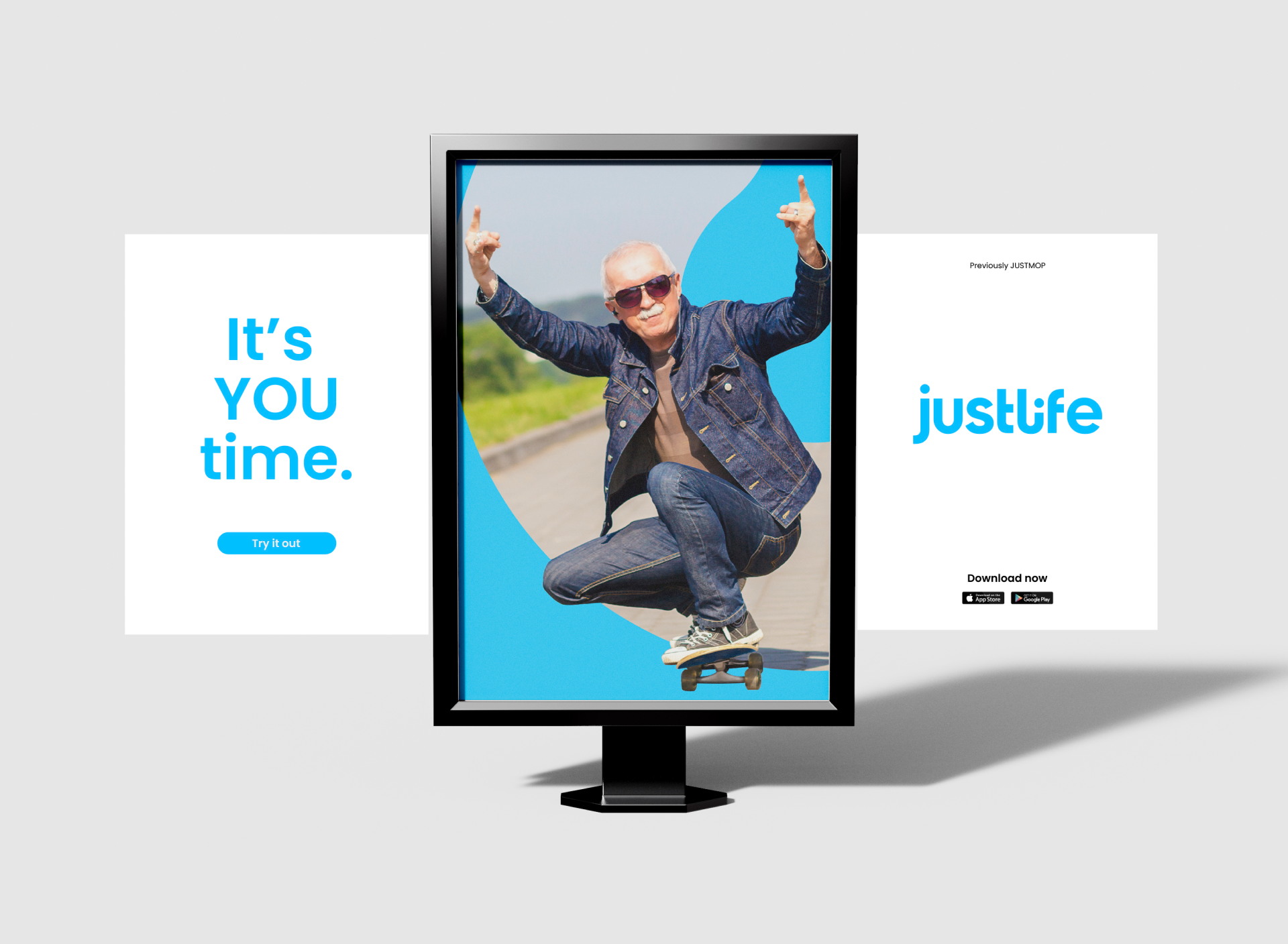
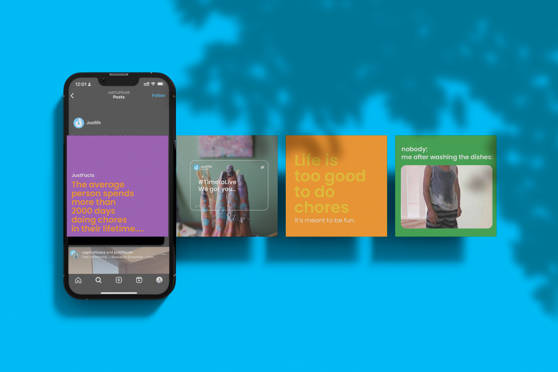
Following the rebrand and creative overhaul, we brought the revamped brand to market with the campaign “Time to Live”. It was important to mention the array of services included on the platform’s roster like Cleaning, Laundry, and at-home PCR tests during the scary Covid-19 days.